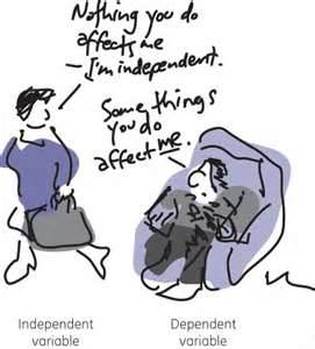
Relationships between Variables
When you are looking for relationships between variables, what you are really doing is interpreting graphs or data by looking for patterns and trends. When you find the pattern or trend, you should then draw a line of best fit to represent it. The line of best fit is drawn to show the general trend from the data.
Rules for Drawing a Line of Best Fit:
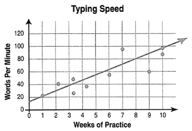
The following graph titled Typing Speed represents a line of best fit:
Rules for Drawing a Line of Best Fit:
- The line should be a straight or curved, not a zigzagged one. It needs to show the overall trend of the data
- When drawing the line, it needs to placed about where half the points are on one side of the line and the other side contains half of the points as well. The drawn line will represent the average of the data.
The following graph titled Typing Speed represents a line of best fit:
How to Write a Statement of Relationship
This is a statement that summarizes the relationship between the independent and dependent variable. The following is an outline to how to write a statement of relationship:
As the (independent variable) (describe how it changes), the (dependent variable) (describe how it changed).
Example of a statement of relationship from the graph above:
As the weeks of practice increases, the words per minutes increased.
